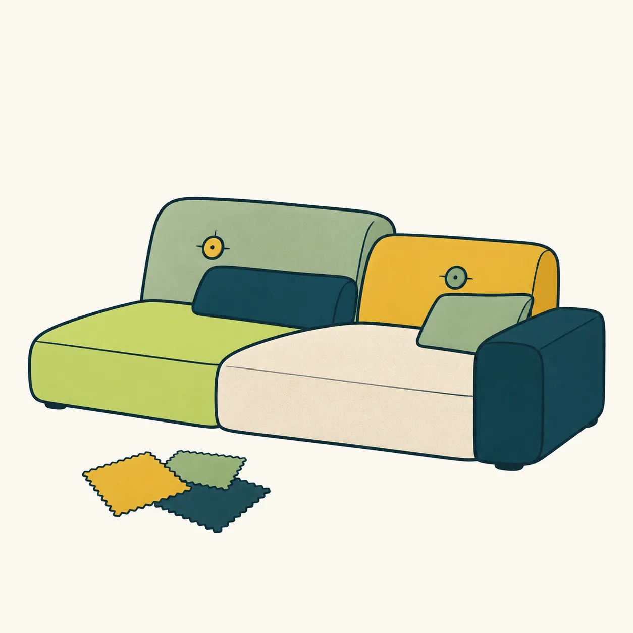
A sofa can seem like one large decision made once: one shape, one colour, one upholstery fabric. Hella Jongerius’s Polder Sofa makes that decision more layered. Vitra identifies its character in asymmetry and the combination of different fabrics and colours. This is not furniture accidentally surrounded by mismatched cushions. The differences belong to the design, inviting us to notice the relationship between its individual parts. [2]
The model was introduced in 2005 and revised in 2015. According to the manufacturer’s account, its name refers to Dutch polders, low-lying areas reclaimed from water through dykes and drainage channels. This is a landscape reference for the sofa’s composition, not a hidden hydraulic function beneath the seat. A name can suggest a way to read an object, provided we do not confuse it with a technical explanation of construction. [1]
Jongerius brings different surfaces together within a coordinated colour family. The detail we choose to examine is adjacency: a cushion never appears entirely alone, because its neighbour enters the composition. Vitra’s account also describes deliberately prominent buttons and stitching. In our reading, these details keep the surface from appearing as a single anonymous skin. They allow materials, joins and parts of the making process to remain individually noticeable. [1]
The Vitra Design Museum holds the studio archive, acquired in 2024, and describes work spanning textiles, ceramics, furniture, lighting and sculpture. The museum emphasises material research and artisanal processes. This context helps us avoid reducing the sofa to a decorative exercise: the question also concerns how an object is conceived and made. An archive documents a practice; it does not prove that every contrast between colours is automatically successful. [3]
Try an editorial exercise: place three paper scraps side by side, then exchange their positions without changing the scraps. We can describe which arrangement we prefer and why without turning that preference into a law of taste. This invites observation of relationships; it is not a scientific experiment proving a theory of perception. The Polder provides a concrete starting point, without requiring anyone to buy furniture or fill a room with contrasts. [2][1]
Our illustration freely interprets coordinated surfaces. It is neither a construction drawing nor a catalogue of commercial versions. The discovery to keep is simple: coherence and uniformity do not always mean the same thing. A whole can remain legible while its parts retain differences. For once, the cushion that looks unlike its neighbours does not necessarily owe the rest of the living room a written explanation. [3]
Take this with youLook at two adjacent surfaces and describe one similarity and one difference: which relationship makes the whole recognisable without erasing its parts?
One idea, in simple words
Hella Jongerius is a designer: she develops objects and studies materials. In her Polder Sofa, the cushions do not all share the same fabric and colour. The differences are chosen to form a whole. Its shape is also asymmetrical: the two sides are not identical. The sofa was introduced in 2005 and revised in 2015. Its name recalls Dutch polders, low-lying land reclaimed from water using dykes and channels. The sofa does not, of course, control water. Imagine three coloured cards side by side: changing their order lets you describe new relationships. This is an editorial example, not a rule about which colours everyone should like. The central point is that different elements can be designed together. [2][1][3]
A little discovery to keep
What did you discover?
Read the sources (3)
- The Original is by Vitra — Polder Sofa Vitra · accessed 4 Nov 2026
- Polder Sofa — Hella Jongerius, 2005/2015 Vitra · accessed 4 Nov 2026
- Hella Jongerius Archive Vitra Design Museum · accessed 4 Nov 2026
Original writing and illustration made with AI assistance. Our editorial method
More in Design