In 1986 April Greiman transformed issue 133 of Design Quarterly into a large folded poster. The Walker Art Center had invited her to make an issue about her work; she chose to carry out a new experiment. A surface to unfold replaced the usual sequence of thirty-two pages. The project’s question, Does It Make Sense?, also concerns what a tool can help a designer imagine. [1][5]
In her recorded account for MoMA, Greiman describes connecting video equipment to her Macintosh to turn images into pixels. She was interested in the resulting grain as a visual quality, comparing it to weaving. The computer therefore became part of the process: possibilities encountered while working could lead towards a composition that had not been entirely anticipated in an initial drawing. [2]
In her LACMA interview she explains a deliberate choice: she was not trying to make low-resolution video resemble fine photography. She placed different visual materials together while allowing their characteristics to remain apparent. Contrasts between rough and sharp images, or different kinds of lettering, became part of the composition. The surface retained traces of the tools that had produced it. [3]
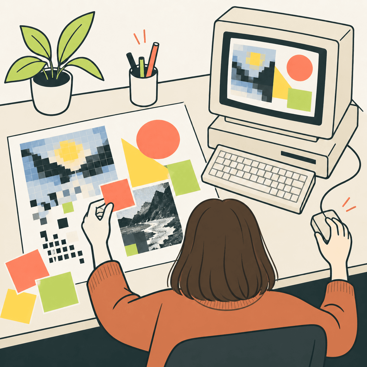
Here is an example invented by our editors. Draw a pear using a continuous line, then represent it by colouring a few large squares on another sheet. Place the two versions together. The second need not pretend to be the first: ask which would make an imaginary exhibition invitation more interesting. Move them, change their proportions and leave an empty area. Before choosing, write down what you want a viewer to notice. This is our exercise, not a reconstruction of Greiman’s personal working method. [3]
The project page on the designer’s website also recalls the physical effort involved in production. The digital composition had to be printed and assembled; its accumulated information caused errors and output difficulties. Greiman names collaborators who helped overcome them. Telling only a story of a happy meeting between artist and machine would leave out the work required for the image to become an object made of paper. [4]
Our interpretation is that a chosen visual characteristic deserves to be distinguished from an obstacle preventing a project from working. On your imaginary invitation, a blocky edge might be intentional; an unreadable date needs correcting. This is an editorial criterion for discussing the exercise, rather than a rule formulated by Greiman. Our illustration accompanies that interpretation too: it presents an invented working scene and does not reproduce the original poster. [4][3]
Take this with youFirst describe the effect you want: which trace of your tool supports the idea, and which makes it harder to understand?
One idea, in simple words
April Greiman designs images and visual communication. In 1986 she turned an issue of a magazine into a large folded poster. She used a computer to compose images and lettering. The result did not look like an ordinary magazine with pages to turn. Opening it revealed a much larger surface. [1][5]
Pixels are the small elements that make up a digital image. Greiman liked the visible texture of images taken from video. She did not always want to hide it. Here is our editorial example: draw a pear with a line, then with large squares. The pictures can work in different ways. Choose one for an invented invitation and explain your choice. This exercise does not reproduce the designer’s work. [2]
A little discovery to keep
What did you discover?
Read the sources (5)
- A Selection of Design Quarterly Walker Art Center · accessed 3 Oct 2026
- April Greiman. DOES IT MAKE SENSE? Design Quarterly #133. 1986 The Museum of Modern Art · accessed 3 Oct 2026
- “The texture of technology”: Q&A with Artist April Greiman Los Angeles County Museum of Art · accessed 3 Oct 2026
- does it make sense? April Greiman · accessed 3 Oct 2026
- April Greiman, Design Quarterly issue 133 poster, 1986 San Francisco Museum of Modern Art · accessed 3 Oct 2026
Original writing and illustration made with AI assistance. Our editorial method
More in Design