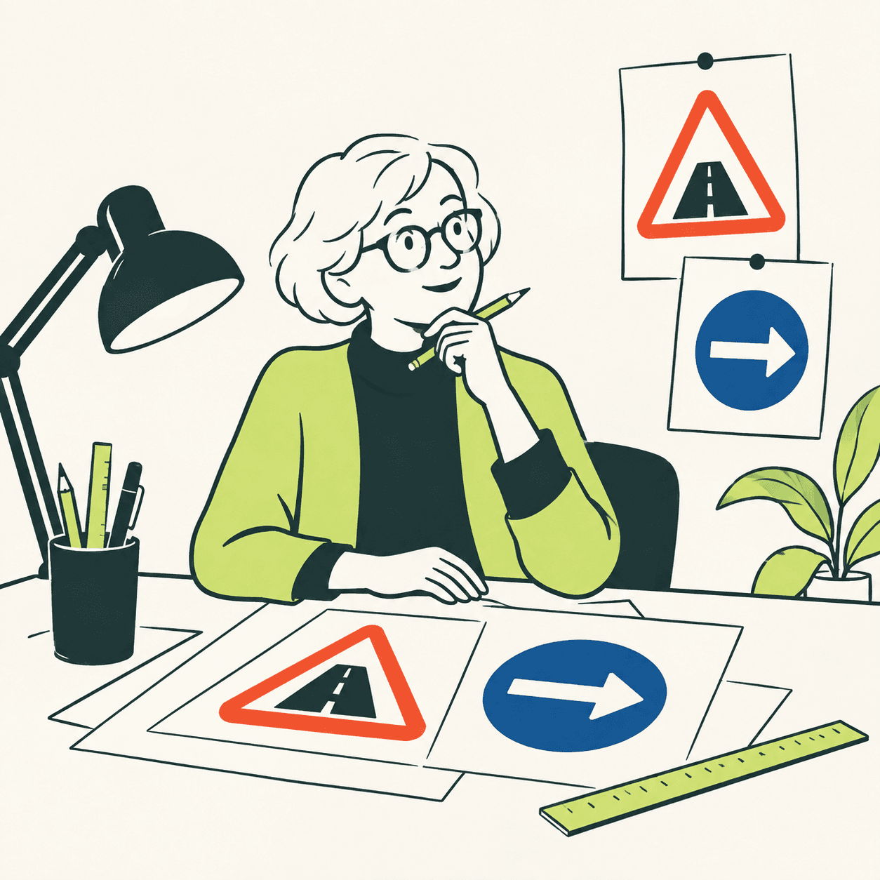
A road sign has very little time to explain itself. Margaret Calvert and Jock Kinneir addressed that problem when designing British road signage: their work began with motorways in the 1950s and continued with other roads. The task involved more than attractive lettering. Colours, symbols, sizes and distances had to work together. Their practical question was what a person approaching a junction needed to understand, while still paying attention to the road ahead. [1]
The system included Transport, a typeface using upper and lower case. The Design Museum describes legibility trials that included signs mounted on vehicles. Letter size depended on the expected traffic speed and the information to be read. That offers a useful distinction: a design may look pleasing close up yet fail when the viewing distance changes. Finding out requires a test, rather than just an opinion about its visual style. [2]
Calvert drew many pictograms: simplified pictures that communicate a message. In the children crossing sign, she placed a girl ahead of a younger boy. The choice updated an earlier image and brought the scene closer to her own experience. This is a specific example of how even a tiny figure contains decisions: who appears, how they move, and which gesture makes the situation understandable to someone passing by. [2]
In her account for the Royal College of Art, Calvert also recalls teaching typography to industrial design students because instructions applied to products were often poorly considered. The same problem can therefore connect an airport, a road and an object. Information does not automatically reach its users simply because somebody has printed it. A designer must consider the moment when people will search for it, read it and interpret its meaning. [3]
Here is an exercise invented by our editors. A class sets up a small exhibition and wants to show where visitors should leave their bags. First it makes a heavily decorated sign, then a version with a clear word, an arrow and more empty space. A classmate unfamiliar with the exhibition tries to find the right place. Which information is immediately clear? What is missing? We are not testing a road: we are learning to distinguish personal taste from a message's usefulness. [1]
Our exercise also has a limit: three classmates cannot represent every visitor, and a symbol is not magically understandable. We therefore record where confusion arises and ask different people what they understood. Calvert's work encourages this attention to the reader; copying one of her signs is not enough to become a thoughtful designer. The outcome to seek is an easier decision for someone using the information, rather than a recognisable imitation of a famous design. [1]
Take this with youDesign a message for someone who does not already know the answer. Then listen to their attempt: a mistake may reveal what the sign needs to change.
One idea, in simple words
Margaret Calvert designed road signs with Jock Kinneir. A sign needs to make sense quickly. The two designers thought about letters, colours, pictures and spaces. They also tested how far away people could read their signs. Calvert drew many pictograms: small pictures that explain something, such as children crossing a road. [1]
Here is an example invented by our editors. At your class exhibition, you need to show visitors where to leave their bags. You draw an arrow and add a simple label. Then ask a classmate who does not know the place to find the right area. If they get confused, you can improve the sign. A useful design should do more than look attractive: it should help the person who meets it. [1]
A little discovery to keep
What did you discover?
Read the sources (3)
- International Women’s Day: Margaret Calvert and her impact Office of Rail and Road · accessed 27 Sept 2026
- Jock Kinneir and Margaret Calvert Design Museum · accessed 27 Sept 2026
- Margaret Calvert Royal College of Art · accessed 27 Sept 2026
Original writing and illustration made with AI assistance. Our editorial method
More in Design