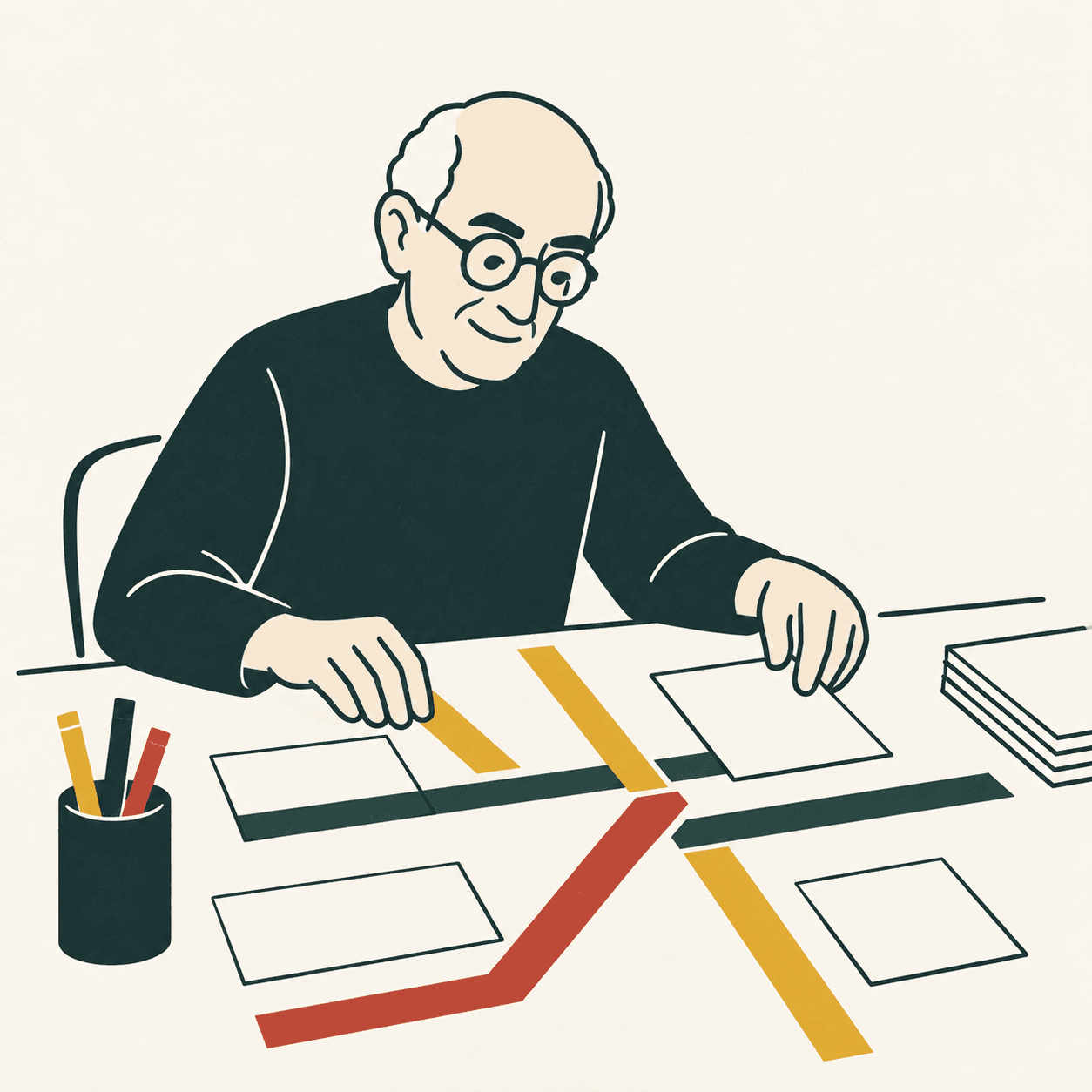
A map answers a question. The New York subway map introduced in August 1972 focused on journeys between stations, using coloured lines, dots and connections. Massimo Vignelli is its best-known name, but it was a team project at Unimark. MoMA also credits Joan Charysyn, the map’s lead designer, and Bob Noorda. Remembering these collaborators gives us a more useful account than the familiar story of a lone genius. [1][2]
The idea was to turn the network into a diagram: a drawing of connections. Routes followed horizontal, vertical and forty-five-degree diagonal directions. Real bends in the tracks and many geographical details gave way to visual order. The aim was not to move the stations themselves. It was to make each route easier to follow across a sheet of paper, without losing the line whenever it turned. [3]
Here is an example invented by our editors. You need to travel from Tree station to Bridge station, changing at Square. A diagram with three dots might explain this better than a drawing crowded with buildings, trees and cars. But if you want to know how far to walk from Square to a friend’s house, those dots are not enough. One image can work beautifully for one task and poorly for another. [1]
That limitation had real consequences. The map attracted criticism and was replaced in 1979 by a more geographically familiar version. Its importance in design history does not erase the difficulties experienced by passengers. We therefore need two separate questions: is the graphic system consistent, and can people catching a train find the information they actually need? Beauty and usefulness cannot always be measured with the same ruler. [2]
The story continued. RIT describes the diagram’s return in The Weekender, a digital project explaining weekend service changes. An idea may work better when it is given a different job. This does not mean every rejected design is a masterpiece waiting to be discovered. It means examining the situation carefully instead of awarding permanent medals or declaring permanent failures. The purpose of a map remains part of its design. [3]
An activity from our editors: draw a route between three places in your school or neighbourhood. In one version, keep the shapes of the real spaces. In another, show only their connections. Ask someone to find a destination and then estimate a distance. Where do they hesitate? This does not recreate Vignelli’s map; it reveals the choice every map makes by including some information and leaving other information out. [1]
Take this with youBefore adding a detail, ask which question it helps answer. A useful map gives clear guidance while also making its limits understandable.
One idea, in simple words
Massimo Vignelli worked with other designers on a famous map of the New York subway. It appeared in 1972. Instead of drawing every bend in the tracks, the team used orderly lines and dots for stations. This was a diagram: a drawing showing how things connect. [1][2]
Here is an example invented by our editors. To get from Tree station to Bridge station, you change at Square. Three connected dots can help you see where to change trains. They cannot tell you how many steps to walk outside the station. Vignelli’s map simplified connections, but it did not show all distances accurately. A useful train map may therefore be less helpful for a walk. Before choosing a drawing, we need to know what it is for. [3]
A little discovery to keep
What did you discover?
Read the sources (3)
- Digital Exhibit — Vignelli New York Transit Museum · accessed 23 Sept 2026
- New York Subway Map, 1970–1972 Museum of Modern Art · accessed 23 Sept 2026
- RIT Press publishes book on Vignelli transit maps Rochester Institute of Technology · accessed 23 Sept 2026
Original writing and illustration made with AI assistance. Our editorial method
More in Design