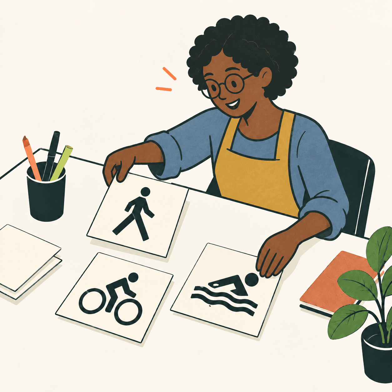
Otl Aicher directed the visual design of the Munich Olympic Games in 1972. He did not work alone: Department XI brought together graphic designers, illustrators and technicians. The International Design Center Berlin’s account credits Gerhard Joksch with sports pictograms and Alfred Kern with information symbols. Remembering those names helps us see the project as a collective achievement, rather than the work of one pair of hands. [1]
A pictogram communicates information through a picture. Aicher’s symbols also aimed to cross language barriers. Our editors propose a question: is an attractive symbol enough to help somebody find an entrance? In our exercise, we will investigate by asking someone who does not already know the answer. [2]
Munich’s designers developed a coordinated system of signs, colours, lettering and rules for combining them. The IDZ account describes a family of forms that could vary while keeping common features. Each new sign did not have to start from scratch. The project’s identity also depended on recognisable relationships between different objects, from a printed programme to a sign beside a path. [3]
The colours had a historical purpose too. Germany’s Patent and Trade Mark Office describes the wish to move away from the propaganda imagery of the 1936 Berlin Games. Light blue and other bright colours contributed to the idea of an open, welcoming event. That intention belongs to the design’s history; it does not mean that a coordinated appearance can solve political or human problems by itself. [4]
Try this example invented by our editors. A school needs signs for its gym, library and garden. Three groups independently choose sizes, arrows and colours: the result might look as though it belongs to three different schools. They try using the same border and arrow style while changing the subject. Then they ask someone unfamiliar with the building where each sign would lead them. That answer matters more than the opinion of the designers, who already know what their pictures mean. [3][2]
This is a learning exercise, not a reconstruction of the exact process used in Munich. It separates consistency from understanding: matching signs can look tidy while remaining unclear. In our imaginary school, adding a readable word or changing the picture is still an option worth discussing. The purpose is to help somebody find their way, rather than to win a competition in graphic mysteries. [2]
Take this with youInvent a sign and show it without an explanation. Ask what it communicates: the answer is a clue for improving it, not a judgement of your drawing skills.
One idea, in simple words
Otl Aicher led a design team for the 1972 Munich Olympics. Together, its members made signs, printed material and other things that visitors would see. Different people worked on different parts. [1]
A pictogram gives information through a picture, including for people unfamiliar with the local language. [2]
Imagine that our editors draw signs for a school library and a gym. We use the same border and arrows, then ask a new visitor where they would go. This is our invented example. If the visitor is confused, we can change the picture or add a word. Matching colours alone do not prove that the message is understood. [3][2]
A little discovery to keep
What did you discover?
Read the sources (4)
- Design as a team sport International Design Center Berlin · accessed 21 Sept 2026
- Die Sprache der Piktogramme Otl Aicher Piktogramme · accessed 21 Sept 2026
- The Rainbow Games International Design Center Berlin · accessed 21 Sept 2026
- Olympia 1972 German Patent and Trade Mark Office · accessed 21 Sept 2026
Original writing and illustration made with AI assistance. Our editorial method
More in Design