A story can already be beginning while the actors’ names appear on screen. American designer Saul Bass explored that possibility by turning film titles into an entrance to the film itself. The Academy holds his archive and describes work that also includes posters, logos and short films. The design question that interests us is straightforward: how can you prepare an atmosphere without revealing the entire plot to the audience? [1]
The British Film Institute describes animated lines in The Man with the Golden Arm, from 1955, and spirals in Vertigo, from 1958, made with animator John Whitney. Movement helps a shape carry meaning. The institute also stresses Elaine Bass’s creative contribution to later collaborations: work associated with a famous name is not necessarily the work of one person. Giving appropriate credit matters as much as noticing the visual invention. [2]
Another clue survives at the Smithsonian: the 1977 poster Bass on Titles, credited to Saul Bass and his studio. Its catalogue describes neighbouring strips of film containing a repeated image. We can use that object to ask a question of our own: when we repeat a shape, are we simply filling space, or suggesting duration, anticipation and change? An archival object can start an experiment without becoming a recipe we have to copy. [3]
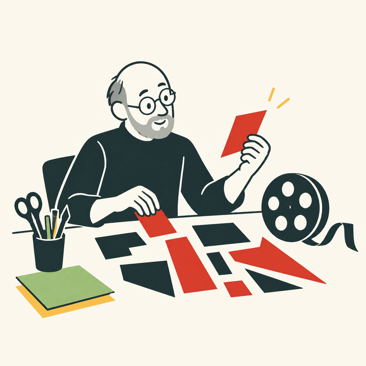
Here is an experiment invented by our editors. Imagine a short film about a child searching for a missing key. Instead of drawing every room, cut three paper rectangles and a circle. Move them across a table, slowly at first, then with uneven pauses. Photograph each position. A viewer might imagine a relaxed search or a hurried one. Those are ideas to test, not an authentic Bass sequence and certainly not meanings that every viewer must perceive. [2]
Now change just one decision: keep the rectangles still and move only the circle. Ask a friend to describe their impression before you explain what you intended. If they see something entirely different, record the difference. There is no need to insist that they looked incorrectly. In our workshop, it is more useful to identify which visual decision produced that impression and whether we want to keep it. An audience cannot automatically read the notes inside our heads. [3]
The exercise has a useful limit: using few shapes does not make every design clear. We chose a tiny problem involving just one missing object. If we add characters, places or instructions, we will need to reconsider what is missing. Our proposed lesson is not to imitate a celebrated poster. It is to decide what to show, when to show it, and how much time to leave the viewer. Even a beginning deserves thoughtful design. [1]
Take this with youChoose an invented story and suggest its mood with three shapes. Then ask someone what they understood: that conversation is part of the design.
One idea, in simple words
Saul Bass designed images for cinema. His work included titles: the sequences showing who made a film. He also used simple moving shapes to introduce a story. He worked with other creative people, including Elaine Bass. [1][2]
Try this example invented by our editors. You want to tell a story about a missing key. Cut out a paper circle and three rectangles. Move the circle between the rectangles and photograph each position. First move it slowly, then more quickly. Ask a friend how the two versions feel. The same shapes can suggest different things when their movement changes. But there is no answer that everyone must give: listen carefully to what your friend understood before explaining your own idea. [2]
A little discovery to keep
What did you discover?
Read the sources (3)
- Saul Bass Collection Academy of Motion Picture Arts and Sciences · accessed 28 Sept 2026
- Celebrating Saul Bass’s centenary: 10 essential title sequences British Film Institute · accessed 28 Sept 2026
- Bass on Titles Cooper Hewitt, Smithsonian Design Museum · accessed 28 Sept 2026
Original writing and illustration made with AI assistance. Our editorial method
More in Design